Brand guidelines are part of your brand identity. Usually, they are compiled in a branding document with information about how to communicate your brand inside and outside of your company. They help your business to paint a clear and consistent picture of the ‘personality’ of your brand which distinguishes you from other brands in the market. Your audience inside and outside of your company will then know what you stand for.
Skip to:
- Checklist: 6 Must-Haves for Basic Brand Guidelines
- Nice-to-Haves For Advanced Brand Guidelines
- Get Started On Your Brand Guidelines
Where to start
Creating brand guidelines can be a difficult job. If you have a new company you might be still finding out what you stand for. For an established company the challenge might be to actually grasp how the brand is seen outside and inside the company as this might be different to how you see it. Brand guidelines need to be clear and detailed so that everyone in the business can follow them.
If you have a new business you might find that your guidelines change. You will realise details over time, so make notes and don’t be afraid to go back to your brand guidelines to update them. Just make sure you communicate the updates to all relevant people. To provide consistency we would recommend sharing the guidelines via a link which is easily accessible for designers and content creators.
Ideally, don’t send around an attached document as you will then have to keep sending around the latest versions once you update the guidelines. This might lead to some people using old versions by accident. While there are a lot of things you can include in your brand guidelines to make them more specific to your brand, there are six things you should definitely cover.
Checklist: Must-Haves For Basic Brand Guidelines
There are a few things that you should definitely cover in your brand guidelines. Your brand story, your logo, colours, typography, images and tone of voice define the core of your brand.

1. Background – Who are You And What Do You Stand For?
This is the first part of your brand guidelines. Here you can include the story of how your brand was founded, how it evolved, the idea behind it and your mission and vision for your company. If the brand name doesn’t point at what you do, explain the background and how you decided to go for the name. Include information on how you perceive yourself. You could also ask your team how they perceive the brand.
2. Logos & Logo Usage
Here you can display your primary and secondary logo versions, when they should be used and how they should be used. The when could for example depend on whether you use it for your website or for documents. The how explains how you want your logo to appear including margins, smallest and biggest possible appearance and clear spaces around your logos. See example here:
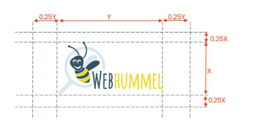
The clear spaces help your logo stand out better. In this section also try to include information about how your logo shouldn’t be used. This will avoid any changes in fonts, colours, shapes or backgrounds which only provide a low contrast. Include anything else which is important for your brand.
3. Colour Palette
As for the colours, display your primary and secondary colours. These are usually the ones which are used in your logo and will help you to create a consistent colour scheme across your website and marketing materials. Make sure you include the codes for RGB, Hex and CMYK. Here you can see how we displayed it.
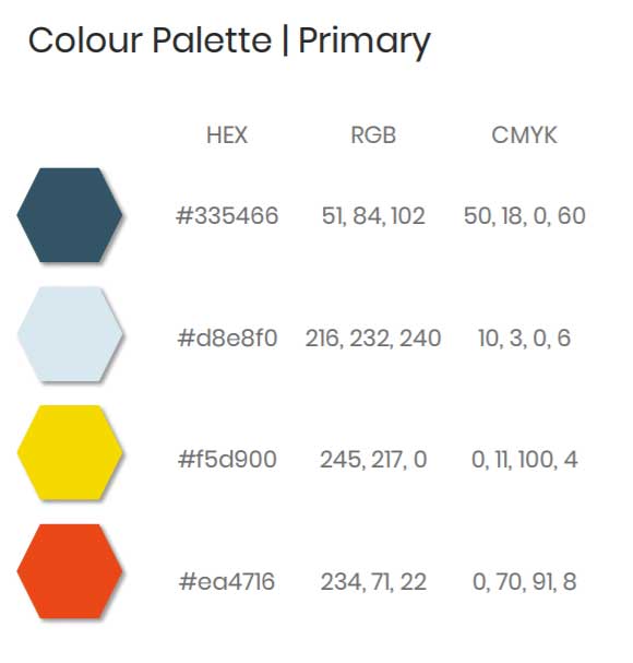
4. Typography
Typography is part of your brand identity. Again you will probably have primary and secondary fonts to choose from. The primary font might reflect the font used in your logo. Choose fonts which reflect your brand. If you haven’t decided on fonts yet you can for example have a look on Google for different fonts.
Don’t choose too many as it will create confusion and inconsistency. For example, we use the primary one which is also used in the logo and a secondary one which is used for most of the headings and body content. Include all of the fonts you use in your brand guidelines. You can also include important information about the background of the fonts and how it is relevant to your brand. Make sure you specify spacing, text sizes & weights for different uses. For example, a heading might have a different size, weight and font to the body content.
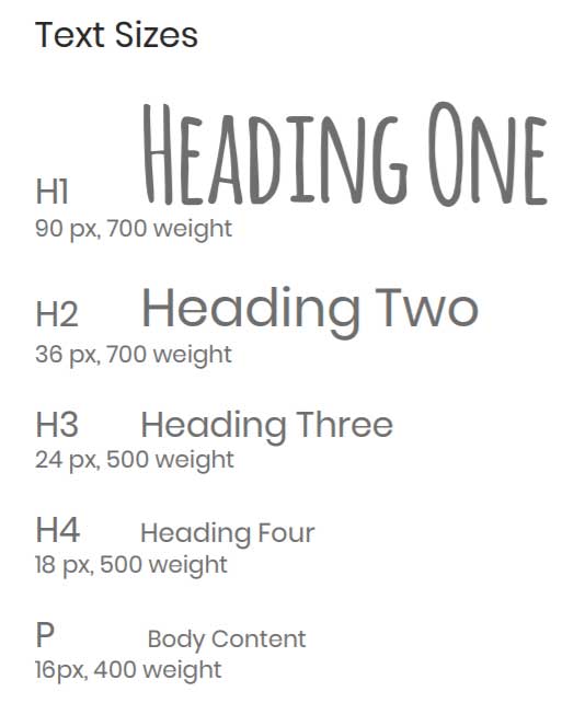
5. Use of Images
Images are an important part of your brand identity and you will need to use them for your website, blog, marketing materials, presentations or other materials. Create a sample of pictures which reflect your brand style and colours. This will help any designers to create consistent content through your digital and non-digital marketing channels.
If you don’t have the budget for a professional photoshoot you can find a number of stock image platforms online where you can find pictures for free or paid for more advanced images. A few examples of good free platforms are Unsplash, Canva, Pexels or Pixabay. Some of the platforms allow you to define your search for colours which can help you to find suitable pictures.

6. Tone of Voice
Your brand document should also include your tone of voice which reflects the way you want to talk to your audience in the content you create. It helps you to give your brand a personality. Do you have do’s and don’ts for words or sayings? Include the information in your branding document. Decide how you would like to sound. Research conducted by the Nielsen Norman Group found that there is a similar pattern for most content and they defined ‘four dimensions of tone of voice’:
- Funny vs. serious
- Formal vs. casual
- Respectful vs. irreverent
- Enthusiastic vs. matter-of-fact
These dimensions can then vary depending on your brand. It can be in one of the dimensions or in between. This information is essential so that content writers know how to convey your messages. If you are a bank, for example, you might choose a serious, formal, respectful and matter-of-fact tone. As a marketing agency, you can be more funny, casual, respectful and enthusiastic. But it depends on your industry, your company and your target audience.
Nice-to-Haves For Advanced Brand Guidelines
There is a lot more useful information which you could include in your brand guidelines. An example would be different colour palettes for mobile, desktop and print media. Additionally, you could include more than one colour scheme which allows a more vibrant presentation of your brand identity. If you decide to do so make sure the additional colours are still reflecting the idea of your brand. You can name your primary colours after your brand. For example, Hubspot calls its primary colour ‘Hubspot Orange’ which adds more identity to it.
You might have certain patterns which you would like designers to use. Include them in your branding document to speed up the design of new content and marketing media.
As for the typography you might want to include a colour palette for your written content with more neutral colours like white, black or dark grey.
Depending on your brand you might have something else which you would like to include. For example, we have included ‘bee puns’ which can be used in written content in our tone of voice. And we have determined when we can use which pun – You’ll see “ ‘bee’ found online” on much of our own material.
Get Started On Your Brand Guidelines
The bottom line is that brand identity is important to establish your brand on the market. There are several things to consider and it might look like a difficult job but it’s also exciting to explore your own brand – almost like children who form groups and invent their own language and rules but on a bigger level.
Your brand guidelines will evolve along with your business so create your first guidelines now and don’t be afraid to review them in the future. To create a ‘buzz’, make sure you include as much as possible of the information required for your brand in the brand guidelines and your designers and content creators can work wonders.